6:47 a.m. on Friday. Had to stop the car before leaving my community.
Have you ever been so bored with the appearance of your blog that you dream of a new template at night? For over a year and a half, I finally got sick and tired of looking at the same old Harbour at Mary’s View. With fear and trembling I customized my blog this morning. It only took a few minutes! With one click, “save your template”, POOF! The old Mary’s View vanished. Eeeks. I thought I could change the post text color in my archives? :o/
It’s still here, all 350+ posts of mine - a large hunk of my life has been saved. Whew. Blogger still scares me. This may be the first time I thanked Blogger for anything.
I’m so giddy with excitement right now that I can’t come up with a story or decent writing about much so here are a few photos I’ve taken lately. None of these make my heart swell so I’m considering this a test.

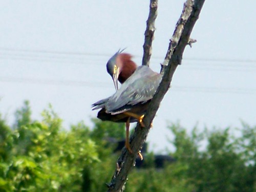
Crappy shot of a Green Heron, I know, but it’s a bird I don’t often see…
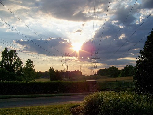
Algae-covered ducks. I wonder if they realize their pond is evaporating inches a day.
~~~~~~~~~~~~~~~~~
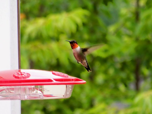
I have a very cute boyfriend on the side. We stalk each other but I know he has his eyes fixed on other ladies.

I have a very cute boyfriend on the side. We stalk each other but I know he has his eyes fixed on other ladies.

A funky tune by David Lee Roth comes to mind:
Just a gigolo
everywhere I go
people know the part I'm playing
He looks so lonely!
I ain't got nobody,
He looks so lonely!
I ain't got nobody,
nobody, nobody cares for me
Nobody, nobody I'm so sad and lonely,
sad and lonely,
sad and lonely,
Won't some sweet mama come and take a chance with me
cause I aint so bad
Get along with me babe,
been singin love songs
all of the time
Even only be, honey only, only be
Bop bozadee bozadee
bop
zitty bop
I.... ain't got nobody
'cept love songs in love
Hummala bebhuhla zeebuhla boobuhla hummala bebhuhla zeebuhla bop
So, folks. You might not hear from me often during the next week or so. I’ll be agonizing about changing my header, title description, and choosing photos for my sidebar. I think I’m in edit/layout heaven. Whoot! This blog might have an entirely different look in a week!
I’ll be with you...promise.





38 comments:
very bold. very dramatic. love the David Lee Roth lyrics for a male hummer. Too perfect.
I love this first header picture of a folded-wing butterfly. Your blog is looking way different already. Good job and have fun creating.
wouldn't let me add photo to my header :(
I know exactly how you feel as I recently completely changed my look. I set up a test blog to practice on and just played till I found something I liked. Then I copied it into my "real blog"
Have fun (it looks great so far)
xo
Well, I didn't mind the old lighthouse--but I understand it is fun to play with new looks.
(Personally, I find reading text on black a bit challenging, but--hey--that's just me.)
I do love the way the photos look against the new template.
I suspect the PLAYING is what is really fun.
Love the new look. I've thought about changing mine and even have a test blog to experiment with but "lawsy, I's afraid, Miss Mary"! I wouldn't want to lose a post or two or 800+.
But someday, you'll come over to May Dreams Gardens, and it will be different!
The same way you know how to frame your subjects in a photo, you'll know when your layout is right. I might have to break down and futz around with mine a bit some day.
WOW May! Cool new look! What's next? You going to go brunette?
Really, your pictures really pop against the black background. And I love that David Lee Roth version. I can see him singing it in my mind's eye.
Oh for Pete's sake-
your word verification is
MZAZWMEN
Hi all,
Now that a few hours have passed, I'm tending to agree with Donna (KGMom). Although photos POP on a black background, the text isn't as relaxed for easy reading. Hmmm. I have work to do :o)
Thanks for all your comments - and Linne, NEVER will I go brunette :o)
Mary
Hi Mary! I like the new look. I have thought about going with the black background too. I think that it makes the pictures pop. Your header is so pretty.
Your little gigolo is so handsome. With a handsome guy like this, you don't mind if he has eyes for the other girls.
Have fun playing around. Can't wait to see what else you come up with. Lisa
Dear Mary,
WOW!!! Very artsy and cool dear heart. I can see you are having fun!
Nice bug...
Mr. Hummer is a very handsome guy. He can come nectar at my house any time. My heart beats fast for him.
I do not know the song but I am singing anyway.
So fun!
Sherry
I like your new blog look - it's fun fooling around with different templates. Enjoy - and your photographs look great against the black background. You have a cute admirer there.
Looking good, Mary! This reminds me, time for a change on my blog, too! I love that David Lee Roth song!
I love how it looks, too,.... but.... bad as I hate to admit it---I'm gettin' old LOL and my eyes really struggle with the text on black. :( And you do know that I adore your blog!! :D Your photos are wonderful---I do just love those little hummers and you got some GREAT photos of him! :)
I must be missing some sort of program on my computer. All I see of the header is the title and the sentence. The rest of it is blank. Hmm...I'll have to see if I can figure it out.
Nice post.
Ooops. My photos are cut off center. Need a "stretch" template. Later :o)
Cool look Mary! I like the pictures against the black background. Personally, I'm one of those who likes to move furniture around and change things here and there, and changing blogs is the same thing.....in fact, I think I'll go play with some new colors later!
As long as Mary stays the same (nice, fun, smart, lovely...), everything can change! ;)
Oooooo....aaaaaaaahhhhh...
FANcy, Mary!
But light text on dark background is a bit tough on the eyes.
I vote that Mary becomes a redhead!
Just kidding. She's beautiful the way she is.
When I get bored, I change my header. I use Cool Text
It's free.
Great new look, Mary.
I sure know that trepitation you feel when you decide to push that button. It is really very easy.
It is always fun to rearrange the furniture.
I'm constantly tweaking my sidebars, and change to an entirely new template at the beginning of the year. Gotta keep it fresh.
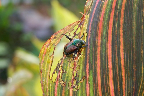
Related, I saw my first Japanese beetle of summer the other day. Only one so far. I think the grackle herd takes care of most of the grubs in the yard before they can get to the beetle stage--a very good reason to encourage the grackles' visits.
Also, IT'S RAINING!!!!
Yea Mary!!!! You did it! You took a deep breath and went for it! I am so proud of you! Now, wasn't that easier than you thought it would be? It looks just great! You'll tweak here and there for a while until you get just what you want. Whoo hooooo!
Actually, I liked your old look, but hey, change is good! Sometimes it helps just to try something different. Love your header picture. I'd like to spend some time with that handsome gigolo, too.
I love this look! And that wasn't a Crappy shot of the Green Heron. ANY shot of a Green Heron is great...they are one tough bird to get!!! The male hummer is stunning...and you picked a perfect song for him!!
Mary, when I clicked your site, I thought sure I was at the wrong place until I saw those photos. Okay, this is it-only Mary can capture birds, bees and bugs like this. The black does make your pictures really stand out. But I too, have a little trouble reading the text. However!! It is your site-do with it what you wish and I will still visit!
Mary...whatever you do I know I will love it......I even love your blurry heron photo, he is just to beautiful to have been left out.
Look forward to seeing what you come up with but then I love ya just the way you are......as the song goes.
Oh, what fun! I can't tell you how much I like playing with the templates and colors. It's such fun! LOL Your blog looks great! I love the new title banner. Very pretty! I think you should be able to adjust the font color in your previous posts by clicking on Fonts and Colors, and creating your default blog colors, as long as you didn't customize the color of the text when you actually created each post.
I've been trying to catch up on visiting blogs today. I'm sooooooo far behind! Life gets in the way too often now. I love this post and the previous ones, too. I've missed reading your great posts, Mary.
Mary:
I, too, spend some time this weekend agonizing over changing the look of my blog. I experimented with some different styles and colors, but didn't get any farther than changing the color of "viewed links" from gray to blue (how bold, how daring!) and adding the bluebird photo to my header. I do like that one, since it is MY photo of "MY" bluebird.
How funny that you had the same thoughts, too. I may change more things as I get braver. Can't wait to see how your blog turns out in the end!
It's just my opinion, but add me to the list of people who find it hard to read text against a black background.
~Kathi, who thinks the photo of the Green Heron preening is too cha-cha for words
You are off to a great start - I love what you've done so far. You have a good eye and great instincts - its beautiful!
Wow! It sure looks different, but a *good* different. Keep up the good work, Mary.
I like your new look, Mary. And the color on black is vivid--sets off the thirsty beetle very nicely.
I think about changing mine, too--at least the header. But it all takes time, and, at the end of the day, time's short.
Congrats on the new YOU!
Woo Hoo Mary! Nice change - it's good to shake things up from time to time. Have fun with your new design. My old eyes don't usually like a black background for text either, but using the larger font and turquoise works fine. Watch out...you might find yourself with another career as web designer!
I LOVE it!! The header photo is awesome!!!! (but can you change the purple color for the text - it is hard to read against the black)?
Otherwise, NICE job!!!!
You are one of my favorites. Love your pictures. I too have a hard time reading with a black background. Guess that comes with age. Have fun with your changes.Whatever you do will be outstanding.
Absolutely LOVE that header photo. I have to ask...did you enhance the colors at all because they are just breathtaking.
I, too, have a bit of a problem with black background. When I go back to reading on a white background, I can still see the lines of type as a negative for a few seconds until I blink them away. But, I have to admit that it does make your photos POP.
Christine,
No, that photo isn't enhanced at all :o) I took it last spring and knew it was a keeper!
Thanks!
Mary, looking good! A good blog cleaning is lke a good house cleaning, it makes you feel all fresh and new! Good for you! I changed my blog header photo just about a week ago. It looks great.
The Green Heron shot is fine, you simply caught the bird action!
http://joec66.blogspot.com/
Post a Comment